Sunroom Makeover
Welcome to my sunroom makeover! This space has always been a little paradise for my plant babies, but I figured it was time for me to enjoy it just as much as they do. Plus, I was over the plain white walls and ready to bring in some personality!
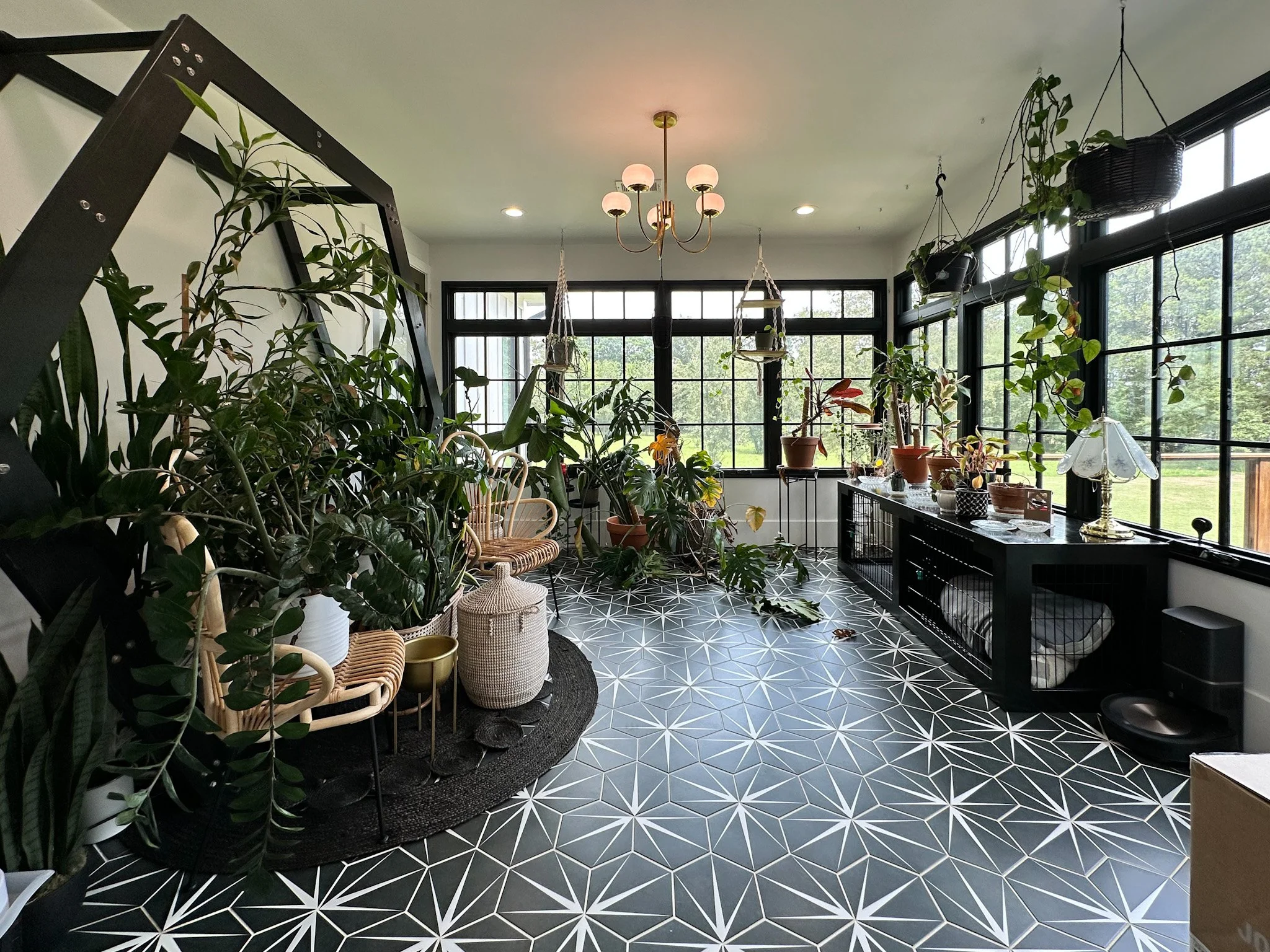
The Before:

The DIY Begins!
First things first—I cleared out the entire room, carefully relocating all my plants to make space for the transformation. I started by adding base cap to the top of my baseboards—something I do for all my makeovers because it makes such a difference! Then, I covered the floors with paper and painter’s tape to protect them from what was coming next—PAINT!
Crown Moulding & Painting
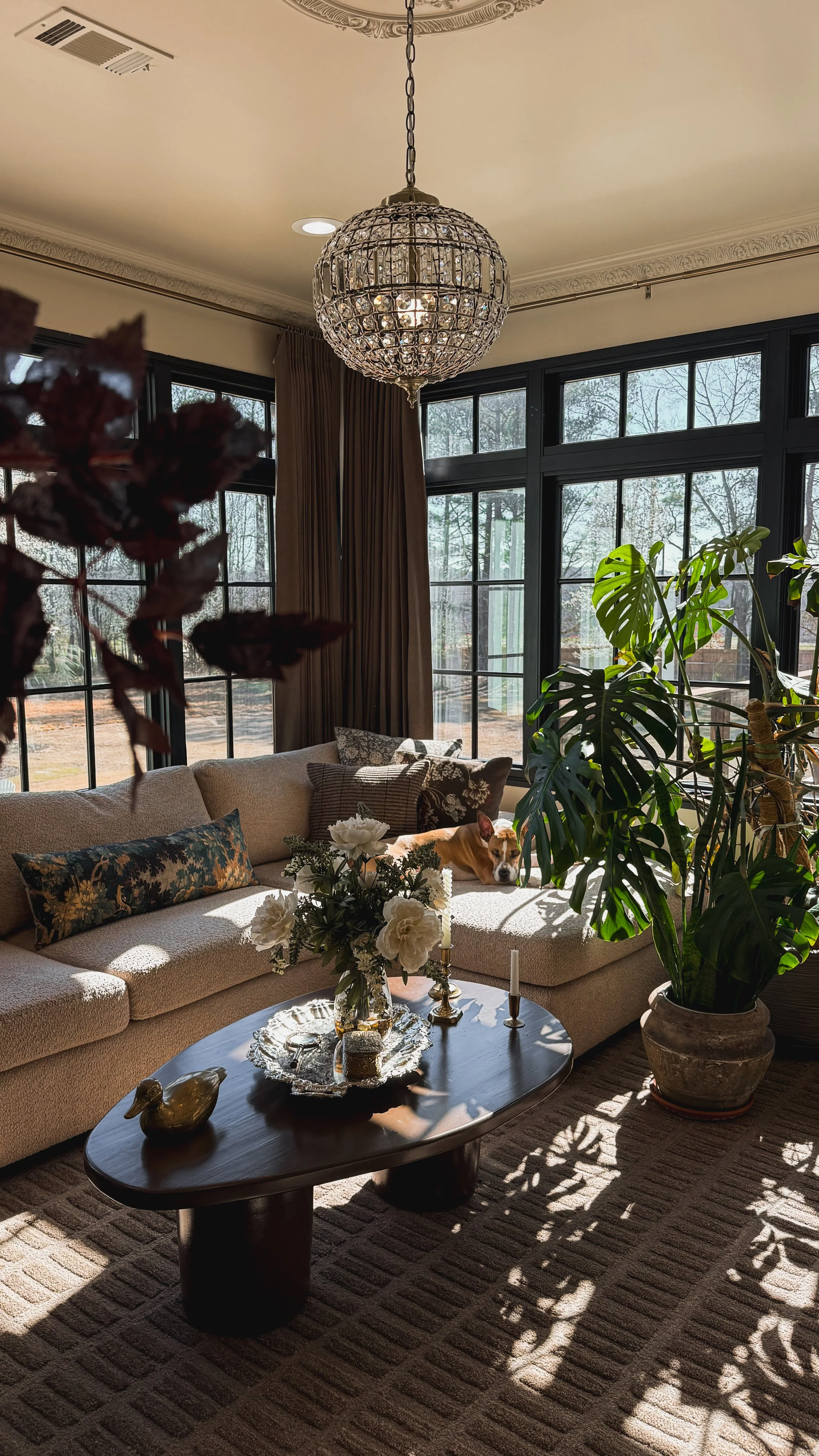
This was only my second time installing crown molding, but with a miter saw, adhesive, and a brad nailer, I got it up pretty quickly! (If you want a step-by-step guide, check out this blog post.) Then, I put my brand-new paint sprayer to the test, and with all the intricate details in this molding, it made the job SO much easier. Since this sprayer isn’t ideal for painting entire rooms—unless you want to refill it a thousand times—I rolled the rest of the walls and ceiling in Maison Blanche by HGTV Home by Sherwin Williams, the dreamiest creamy beige that I’m completely obsessed with!
Ceiling Medallion & Chandelier
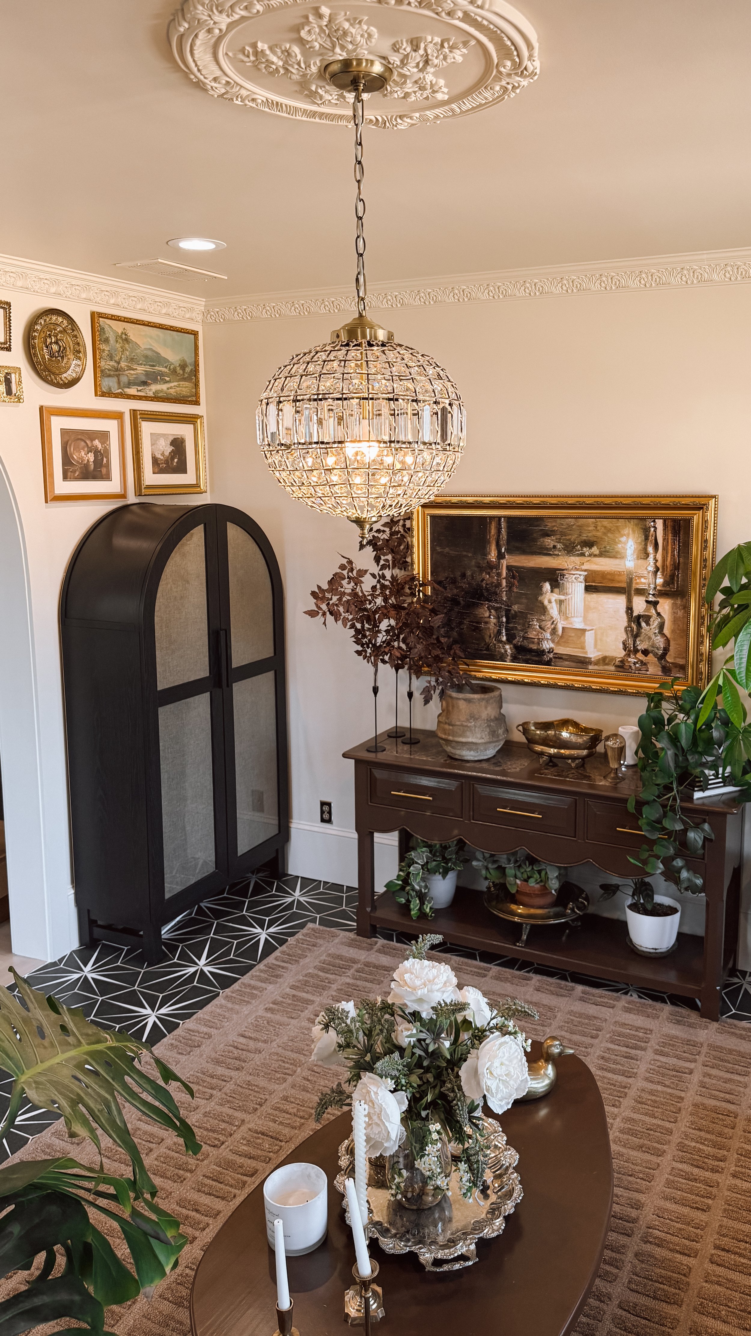
Next up was painting and hanging the gorgeous ceiling medallion! I used the paint sprayer again to get into all the intricate details, and it paired perfectly with a beautiful chandelier I found on Amazon. It instantly took the space to the next level! I also painted the arch leading into the dining room to create a smoother, more seamless color transition.


Time to Decorate!
Once the painting was done, it was time for my favorite part—decorating!
First, I rolled out this stunning brown rug that I am still completely in love with.
Then, I created a gallery wall on the arched wall—if you want to see my step-by-step method, check out this blog post!
I even built my first-ever piece of furniture—a DIY coffee table! (Check out this blog post to see how I did it!)
I found the perfect arched cabinet but decided to add fabric to the inside of the doors to hide the clutter—see the transformation here!
I painted both my DIY coffee table and a beautiful scalloped console table (a Facebook Marketplace find! Check out that blog post here!) using Cabinet and Furniture Paint in Otter by HGTV Home by Sherwin Williams. The deep brown looked stunning against the creamy walls!
To finish it off, I swapped out the knobs on the console table’s drawers for a little extra charm.
I also added brown pinch pleated blackout curtains on gold rods with gold eyelets, which added such a luxurious and cozy touch to the space. The warm tones complemented the creamy walls perfectly and tied everything together beautifully!


The Finishing Touches
One of my best finds was the bouclé couch in the color Alabaster with washable cushions—SO comfy and practical! After adding the final decor touches and bringing back some of my plants (while redistributing the rest throughout my home), I thought the room was finished... but of course, I wasn’t quite done yet!


The Final Addition: A Frame TV
Since this sunroom quickly became our go-to lounging space, adding a TV just made sense. We installed our second Frame TV, and instead of DIY-ing a frame, this time I simply bought one. To keep things sleek, my husband cut a hole in the drywall and installed a recessed box, running the power through the wall to keep the cords completely hidden. Now, the TV sits flush against the wall and looks just like a piece of art!
And that’s a wrap! My sunroom is now the coziest spot we hang out in all the time—without sacrificing my plants’ happiness. Hope you loved following along with this makeover! Let me know what you think in the comments!


Links at a glance
Cabinet and Furniture Paint: Otter by HGTV Home by Sherwin Williams
Console Table: Facebook Marketplace
IF YOU ENJOYED THIS POST, YOU MIGHT BE INTERESTED IN MY DIY: Cabinet cover-up POST.
FOLLOW ME ON MY SOCIALS!

DIY: Cabinet Door Cover-Up
DIY: Cabinet Door Cover-Up - A Simple Fabric Fix
Sometimes, finding the perfect piece of furniture within budget just isn’t possible—but a little DIY can make it work! Arch cabinets with solid doors can be pricey, so I grabbed this one with glass doors for a fraction of the cost.
I knew it would be great for storage, but I wanted to keep everything inside hidden. Let’s just say my hosting dishware collection is extensive—and while it’s all beautiful, it’s also very much crammed into this cabinet to maximize space. My first plan was to create a soft, gathered curtain look (inspo pictured below) with floral fabric. I spent about $40 on the fabric, only to realize I didn’t have enough space inside the doors to make it work.


I thought about laying the fabric flat against the glass, but it didn’t have the look I was going for. That’s when I remembered a piece of upholstery fabric I had thrifted from Goodwill for $9.99. I pulled it out, tested it on the doors, and liked it much better.


Here’s how I made it work:
Removed the doors for easier handling.
Cut the fabric to fit the glass panels.
Cleaned the glass to remove any dust or smudges.
Stapled the fabric to the back of the doors using 1/4-inch staples, pulling it tight and working in sections.
Trimmed the excess fabric for a neat finish.
Rehung the doors and started filling the cabinet.


I don’t think everyone needs to cover their cabinet doors, but for my space, I wanted a solid look without spending a fortune on new doors. This solution worked perfectly, and I love the end result. Now I have a functional storage piece that fits my needs and style.
Click here to shop the arched cabinet!
A little creativity can go a long way in making a piece work for you! Happy DIY-ing!!
IF YOU ENJOYED THIS POST, YOU MIGHT BE INTERESTED IN MY DIY: Coffee table post.
FOLLOW ME ON MY SOCIALS!

DIY: Coffee Table
DIY Concrete Coffee Table: How I Made My First Piece of Furniture!
I got the biggest compliment ever! Someone asked me where I bought my coffee table, and I proudly told them, “I freaking made it!!!” Yes, you read that right—this beautiful piece of furniture is 100% DIY, and I couldn't be more excited to share how I did it!
A year and a half ago, I decided it was time to stop just wishing and start doing. There was this huge item on my “to-make” list: a handmade coffee table. But even with all my accomplishments, this was the one thing I had never attempted. I always thought furniture-building was something I’d never tackle—but it turns out, all I needed was the right project to make it happen.
I kept it simple because, let’s face it, I have a tendency to overcomplicate things, which can lead to procrastination (yep, guilty!). I needed something easy to ease into this whole furniture-making world. So, I grabbed a piece of project board from Lowes, a couple of 5-gallon buckets, and some concrete, and got to work. Here’s how I did it!
Plan the Design
First things first, I decided on the size and shape of the table I wanted. I drew everything out with pencil directly on the project board and carefully cut it out with my jig saw, then sanded it on both side including rounding out the edges. Simple and clean. No overthinking.


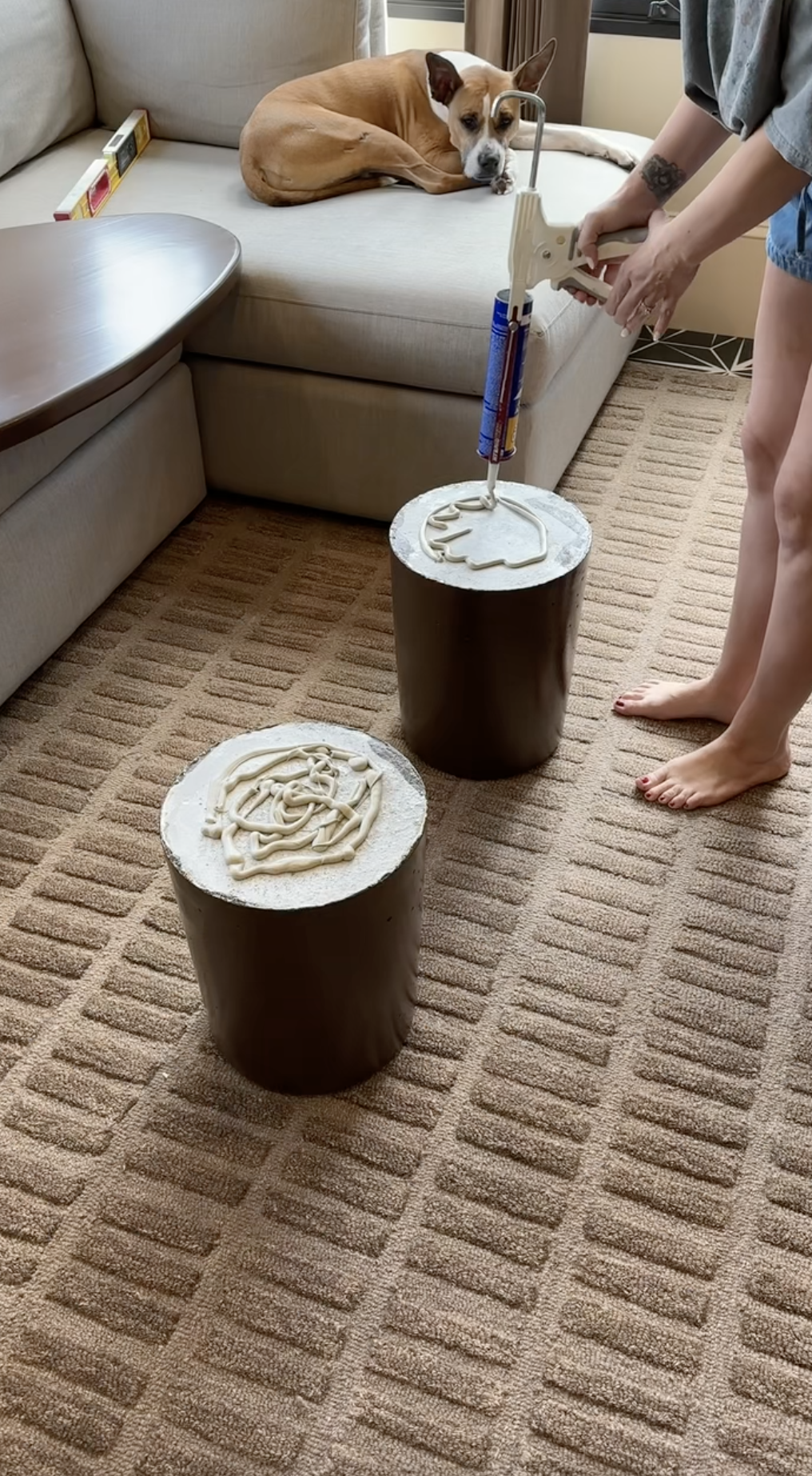
Concrete Molds
Then, I greased the inside and filled two 5-gallon buckets with mixed concrete using an eggbeater attachment on my drill (talk about a heavy project—good thing I had help!). After the concrete set and dried inside the buckets overnight, I removed it to reveal the perfect concrete molds for the legs. To release the concrete I cut a slit on the bottom of the bucket to make the removal of the bucket easier! Note: concrete is heavy—this is definitely a two-person job. Trust me, my back can tell you all about it (I’m basically 80, with the way I decorate my house, right?!).


Painting the Table
Now the real fun begins. I started with one coat of primer, followed by a couple of coats of paint using my paint sprayer - making sure I was lightly hand sanding in-between each coat with 220 grit sandpaper. I used Cabinet and Furniture Paint in the color Otter by HGTV Home by Sherwin Williams! Then, to protect my hard work, I added a few layers of polyurethane using a throw away roller and brush.


Putting It All Together
Let this part be a lesson on what not to do. I connected the concrete legs to the table top using construction adhesive. Sure, maybe it wasn’t the most professional connection, but I’m still learning! Next time I’ll upgrade my technique.

Final Product!
And voila—look at this beauty! It’s gorgeous and it’s 100% made by me. In fact, someone even asked if they could buy one just like it. I’m taking that as a massive win!
So if you've been dreaming about creating something like this, stop waiting for the "perfect" time. Grab your materials, keep it simple, and just start. You might surprise yourself with what you can create. Happy DIY-ing!


IF YOU ENJOYED THIS POST, YOU MIGHT BE INTERESTED IN MY FAQ: Color drenching doorways POST.
FOLLOW ME ON MY SOCIALS!

Color Drenching
Transform Your Space with Color Drenching
If you love bold, statement-making interiors, color drenching might just be your new favorite design trick! This trend is all about embracing a single hue and using it across walls, ceilings, trim, and even furniture for a rich, immersive effect. Whether you want to create a cozy, moody vibe or a bright, energetic space, color drenching is an easy way to make a big impact. Let’s dive in!


Moody Elegance: Color Drenching in the Primary Bedroom
This stunning room is a perfect example of the power of color drenching. Painted in Field Trip by Clare, the deep olive green envelops the walls, ceiling, trim, and even doors in an ultra-cohesive and immersive atmosphere. The single-hue approach enhances the room’s architectural details, making the intricate molding and paneling stand out in a sophisticated way. The eggshell sheen adds a subtle warmth and soft texture that elevates the space.
This space proves that color drenching isn’t just about painting everything the same shade—it’s about layering textures, finishes, and complementary tones to create a truly stunning effect!
If there's something in this room that catches your eye and you'd like the link, just click here!


A Bold and Inviting Hallway with Color Drenching
Hallways are often overlooked in design, but this space shows how a rich, saturated color can elevate even the most transitional areas into something special. Painted in Reddened Earth by HGTV Home by Sherwin-Williams, the warm, earthy tone envelops the walls, trim, and ceiling in a cozy yet dramatic embrace. This terracotta-inspired hue adds depth and warmth, creating a welcoming atmosphere as you move through the space.
Color drenching here brings out the architectural details, allowing the moldings and doorways to flow seamlessly into the design, avoiding any interruptions to the visual flow. The warm undertones complement the natural wood elements and soft lighting, enhancing the intimacy and stylish vibe of the space. The walls and ceiling are finished in satin sheen, while the doors have a semi-gloss finish. If I had to do it again, I would opt for satin on the doors as well—the semi-gloss feels a bit too glossy for my taste.
This hallway proves that even the smallest spaces can make a big impact with the right color and finish choices!
If there's something in this room that catches your eye and you'd like the link, just click here!


Soft & Serene: A Dreamy Bedroom with 50% Malted Milk
For a cozy yet elevated feel, this 50% Malted Milk by Sherwin-Williams color-drenched bedroom is the perfect balance of warmth and softness. By using a lighter, custom-mixed version of this creamy beige, the space feels airy and inviting while still offering a rich, enveloping effect. The walls, ceiling, and trim all blend seamlessly, creating a soothing and cohesive environment—perfect for a restful retreat.
The eggshell sheen adds just the right amount of softness while reflecting a touch of light, keeping the space feeling warm and welcoming. Looking back, I would opt for 100% Malted Milk instead for a bit more depth and richness, but this toned-down version still creates a beautiful and serene atmosphere.
Color drenching in this subtle, warm tone proves that neutrals can be just as impactful as bold colors, bringing depth and character while maintaining a timeless, calming aesthetic.
If there's something in this room that catches your eye and you'd like the link, just click here!


Fiery & Bold: A Red Bathroom
For a bathroom with impact, Salute by Sherwin-Williams is the perfect deep red hue. Its rich, warm tone envelops the space, creating a bold yet inviting atmosphere. Paired with crisp white trim, the contrast highlights the red's intensity without feeling overwhelming.
The eggshell sheen offers a soft luster, reflecting light while maintaining the color's depth and drama. This striking shade pairs beautifully with gold hardware and dark wood, creating a dynamic yet cozy retreat. Salute proves that bold colors can add warmth and character, transforming a bathroom into a memorable space.
If there's something in this room that catches your eye and you'd like the link, just click here!


Bright & Airy: A Sunroom Drenched in Light
For a sunroom that celebrates natural light, Maison Blanche by HGTV Home by Sherwin-Williams is the perfect soft, creamy white. The hue captures the sunlight streaming through the windows, enhancing the space with a fresh, open feel. Color drenching the walls, ceiling, and trim creates a seamless, airy environment that feels expansive and peaceful.
The satin sheen adds a subtle glow, reflecting light while maintaining a smooth, sophisticated finish. The warm undertones of Maison Blanche complement the abundance of natural light, making the room feel both bright and inviting. This soft white pairs effortlessly with light wood furniture and vibrant greenery, transforming the sunroom into a serene retreat that feels connected to the outdoors.
If there's something in this room that catches your eye and you'd like the link, just click here!


A Playroom Full of Color & Fun
For a lively and cheerful playroom, Pressed Flower by Sherwin-Williams brings the perfect pop of color. This soft, yet vibrant hue adds warmth and energy to the space, creating an environment where creativity can flourish. Drenching the walls in this joyful tone envelops the room in a welcoming, playful atmosphere.
The flat finish provides a smooth, understated look, but I recommend opting for eggshell for a bit more durability and a subtle sheen that’s easier to clean. Pressed Flower pairs beautifully with colorful toys, playful patterns, and cozy textures, making it a space where fun and imagination can run wild. It’s the perfect backdrop for a room that will grow with your child, offering both whimsy and warmth.
If there's something in this room that catches your eye and you'd like the link, just click here!

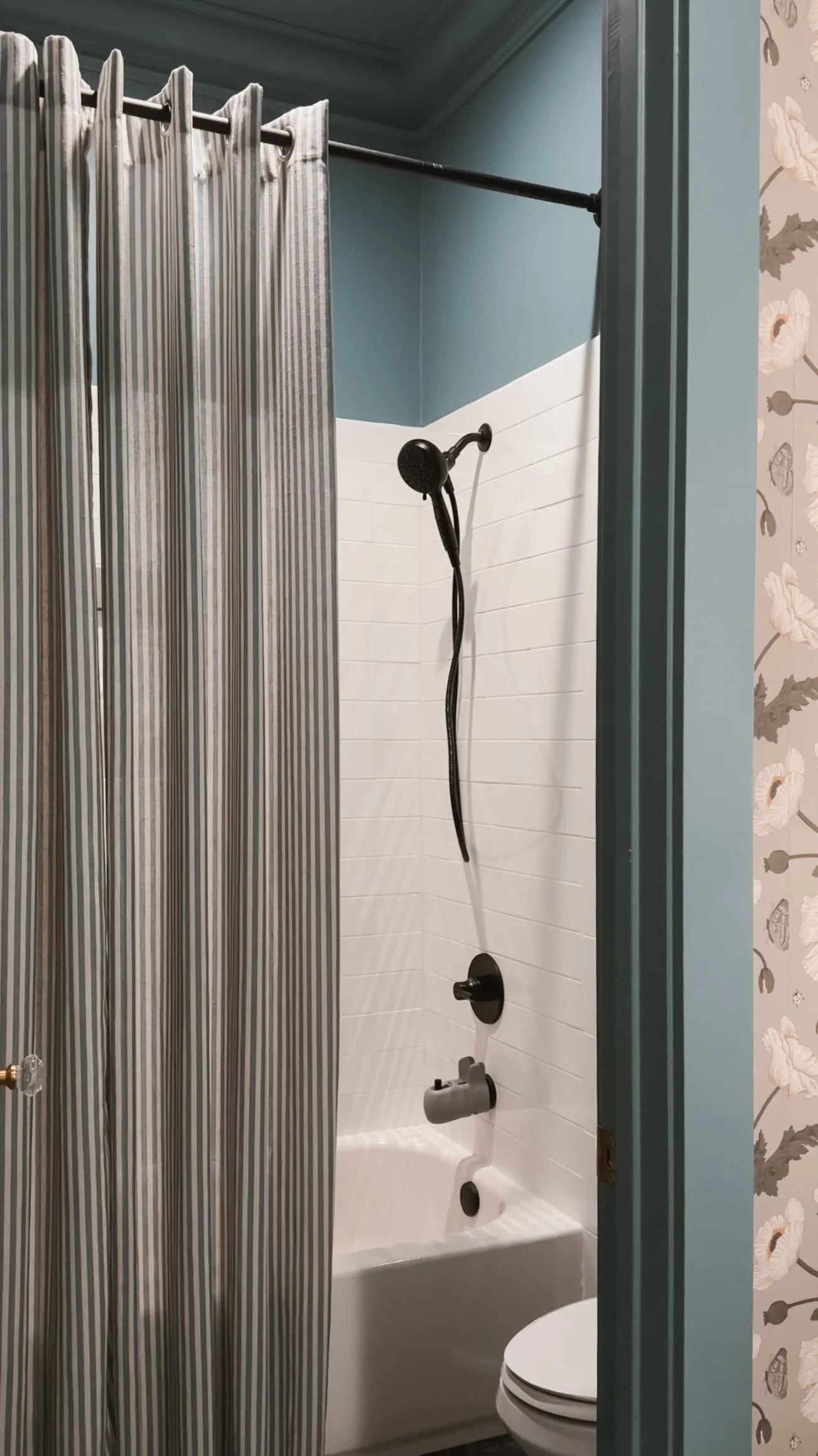
A Tranquil Blue Bathroom Retreat
Norwegian Blue by Behr brings a calming, cool tone to this beautifully color-drenched bathroom. The front room, with its sinks, features a floral wallpaper that adds texture and depth, while the back room—containing the toilet and shower—embraces the full power of this rich blue, creating a serene and cohesive feel throughout.
The eggshell sheen offers a soft, reflective glow that enhances the depth of Norwegian Blue, providing just the right amount of light without being too shiny. The color works harmoniously with the bathroom's fixtures and textures, making the space feel both fresh and tranquil. Whether you’re washing up or relaxing, this blue bathroom offers a peaceful retreat that feels timeless and inviting.
If there's something in this room that catches your eye and you'd like the link, just click here!


Warm & Inviting: A Guest Room with Rich Comfort
Nut Brown by Behr creates a cozy and welcoming atmosphere in the guest room, wrapping the space in a rich, earthy hue. Color drenching the walls in this deep brown gives the room a grounded, intimate feel, perfect for guests to relax and unwind.
The eggshell sheen adds a soft, subtle glow that highlights the depth of Nut Brown without overpowering the space. This warm, inviting color pairs beautifully with plush bedding, soft lighting, and natural wood accents, creating a serene environment that makes every guest feel at home. The timeless richness of Nut Brown ensures the room remains stylish and comfortable, offering a restful retreat for anyone who stays.
If there's something in this room that catches your eye and you'd like the link, just click here!
IF YOU ENJOYED THIS POST, YOU MIGHT BE INTERESTED IN MY playroom makeover.
FOLLOW ME ON MY SOCIALS!

New House Interior Design Plan
Hi guys! I thought it would be fun to show you what is currently in my head and on my mood boards for each room of the new house. If you want to see ALL of my Pinterest boards, click here.
LIVING ROOM
The living room, kitchen, and dining room are all open concept and we are keeping the design in those three areas very modern. To the left of the fireplace area is a large 18’x18’ window so this area will get a lot of light.
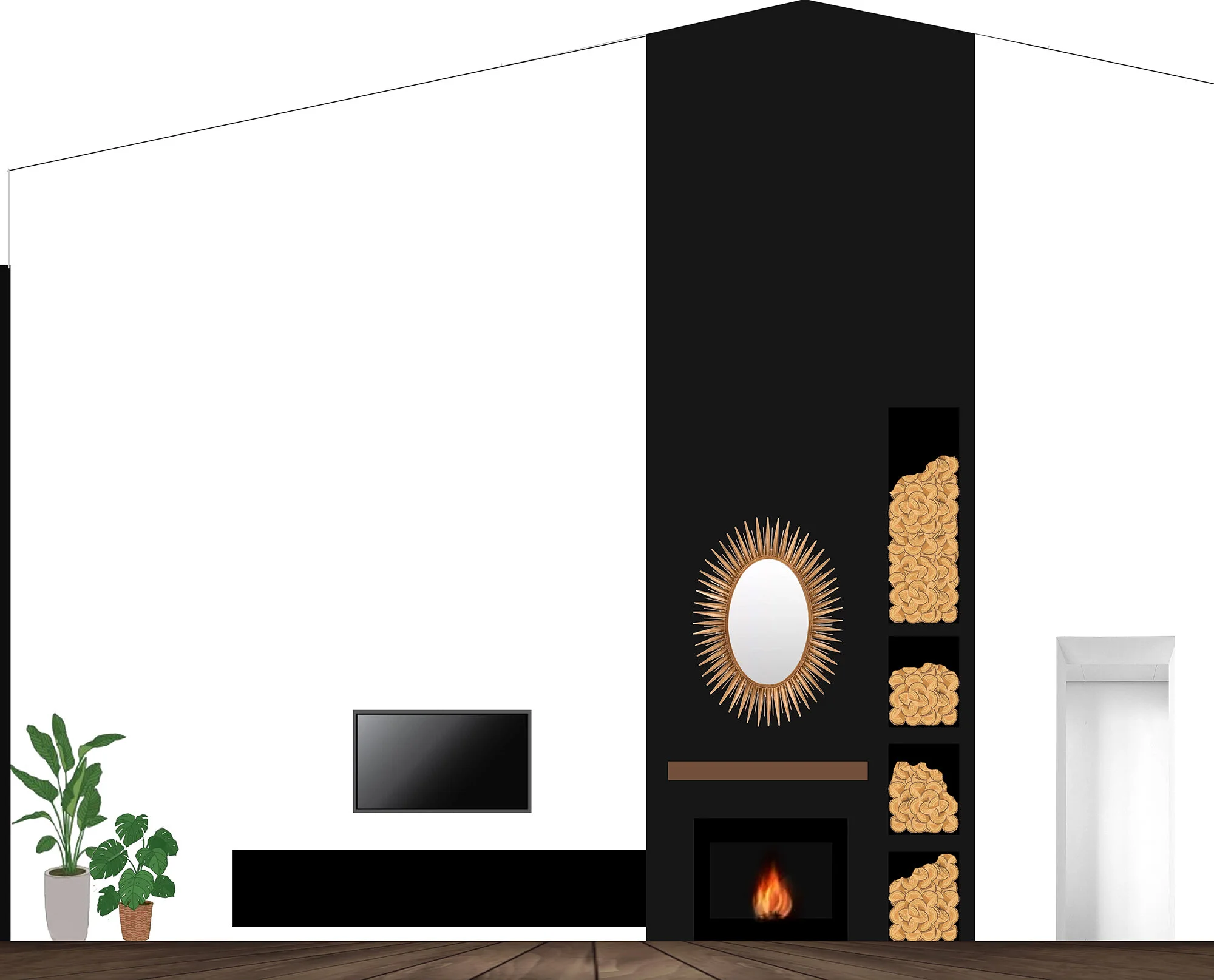
I made this design to scale for the living room.


KITCHEN
I've already shared our full kitchen design on the blog, but here it is again.


DINING ROOM
I would love for the dining room to have a raw edge table, cool band posters nicely framed on the wall to show our personality, and a neon light in the space. I’m still undecided about a rug, light fixture, and chairs.


SUNROOM
The sunroom is one of my favorite rooms of the new build! I’ve had it planned since the beginning and I can’t wait to fill it with plants! The window are very similar to the photo below and the tile on the bottom right is what I’ve picked out!

MY OFFICE
I love pink and green together and I think this is the direction I’ll go in for my office. I prefer the pink shade in the middle photo and love the wall trim for an added sophisticated look.

MASTER BEDROOM
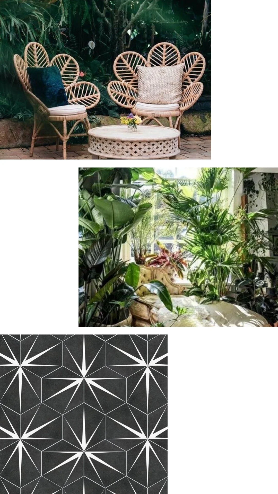
The rest of the house is so modern and/or bold that I thought making the master bedroom more calm and earthy would make for a relaxing space. I love the bali vibes, rattan furniture, pampas grass, neutral tones, and natural textures.

MASTER BATHROOM
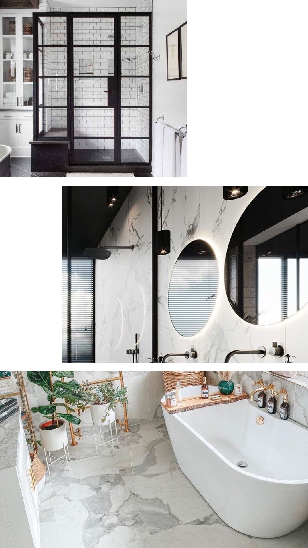
The master bathroom is still undecided except I know I want the black grid shower, free standing bathtub, marble-look tile, and mirrors with lights around them. Everything else is still being decided on.
HALF BATHROOM
Who knew I could be so excited about a half bathroom? I love the idea of going REALLY bold in a small space because it’s low risk. I imagine a really bold wall paper, a funky mirror, and fun TP/hand towel holders.


Want to see even more? Check out my Pinterest where I have a board for each room of the house!