
Color Drenching
Transform Your Space with Color Drenching
If you love bold, statement-making interiors, color drenching might just be your new favorite design trick! This trend is all about embracing a single hue and using it across walls, ceilings, trim, and even furniture for a rich, immersive effect. Whether you want to create a cozy, moody vibe or a bright, energetic space, color drenching is an easy way to make a big impact. Let’s dive in!


Moody Elegance: Color Drenching in the Primary Bedroom
This stunning room is a perfect example of the power of color drenching. Painted in Field Trip by Clare, the deep olive green envelops the walls, ceiling, trim, and even doors in an ultra-cohesive and immersive atmosphere. The single-hue approach enhances the room’s architectural details, making the intricate molding and paneling stand out in a sophisticated way. The eggshell sheen adds a subtle warmth and soft texture that elevates the space.
This space proves that color drenching isn’t just about painting everything the same shade—it’s about layering textures, finishes, and complementary tones to create a truly stunning effect!
If there's something in this room that catches your eye and you'd like the link, just click here!


A Bold and Inviting Hallway with Color Drenching
Hallways are often overlooked in design, but this space shows how a rich, saturated color can elevate even the most transitional areas into something special. Painted in Reddened Earth by HGTV Home by Sherwin-Williams, the warm, earthy tone envelops the walls, trim, and ceiling in a cozy yet dramatic embrace. This terracotta-inspired hue adds depth and warmth, creating a welcoming atmosphere as you move through the space.
Color drenching here brings out the architectural details, allowing the moldings and doorways to flow seamlessly into the design, avoiding any interruptions to the visual flow. The warm undertones complement the natural wood elements and soft lighting, enhancing the intimacy and stylish vibe of the space. The walls and ceiling are finished in satin sheen, while the doors have a semi-gloss finish. If I had to do it again, I would opt for satin on the doors as well—the semi-gloss feels a bit too glossy for my taste.
This hallway proves that even the smallest spaces can make a big impact with the right color and finish choices!
If there's something in this room that catches your eye and you'd like the link, just click here!


Soft & Serene: A Dreamy Bedroom with 50% Malted Milk
For a cozy yet elevated feel, this 50% Malted Milk by Sherwin-Williams color-drenched bedroom is the perfect balance of warmth and softness. By using a lighter, custom-mixed version of this creamy beige, the space feels airy and inviting while still offering a rich, enveloping effect. The walls, ceiling, and trim all blend seamlessly, creating a soothing and cohesive environment—perfect for a restful retreat.
The eggshell sheen adds just the right amount of softness while reflecting a touch of light, keeping the space feeling warm and welcoming. Looking back, I would opt for 100% Malted Milk instead for a bit more depth and richness, but this toned-down version still creates a beautiful and serene atmosphere.
Color drenching in this subtle, warm tone proves that neutrals can be just as impactful as bold colors, bringing depth and character while maintaining a timeless, calming aesthetic.
If there's something in this room that catches your eye and you'd like the link, just click here!


Fiery & Bold: A Red Bathroom
For a bathroom with impact, Salute by Sherwin-Williams is the perfect deep red hue. Its rich, warm tone envelops the space, creating a bold yet inviting atmosphere. Paired with crisp white trim, the contrast highlights the red's intensity without feeling overwhelming.
The eggshell sheen offers a soft luster, reflecting light while maintaining the color's depth and drama. This striking shade pairs beautifully with gold hardware and dark wood, creating a dynamic yet cozy retreat. Salute proves that bold colors can add warmth and character, transforming a bathroom into a memorable space.
If there's something in this room that catches your eye and you'd like the link, just click here!


Bright & Airy: A Sunroom Drenched in Light
For a sunroom that celebrates natural light, Maison Blanche by HGTV Home by Sherwin-Williams is the perfect soft, creamy white. The hue captures the sunlight streaming through the windows, enhancing the space with a fresh, open feel. Color drenching the walls, ceiling, and trim creates a seamless, airy environment that feels expansive and peaceful.
The satin sheen adds a subtle glow, reflecting light while maintaining a smooth, sophisticated finish. The warm undertones of Maison Blanche complement the abundance of natural light, making the room feel both bright and inviting. This soft white pairs effortlessly with light wood furniture and vibrant greenery, transforming the sunroom into a serene retreat that feels connected to the outdoors.
If there's something in this room that catches your eye and you'd like the link, just click here!


A Playroom Full of Color & Fun
For a lively and cheerful playroom, Pressed Flower by Sherwin-Williams brings the perfect pop of color. This soft, yet vibrant hue adds warmth and energy to the space, creating an environment where creativity can flourish. Drenching the walls in this joyful tone envelops the room in a welcoming, playful atmosphere.
The flat finish provides a smooth, understated look, but I recommend opting for eggshell for a bit more durability and a subtle sheen that’s easier to clean. Pressed Flower pairs beautifully with colorful toys, playful patterns, and cozy textures, making it a space where fun and imagination can run wild. It’s the perfect backdrop for a room that will grow with your child, offering both whimsy and warmth.
If there's something in this room that catches your eye and you'd like the link, just click here!

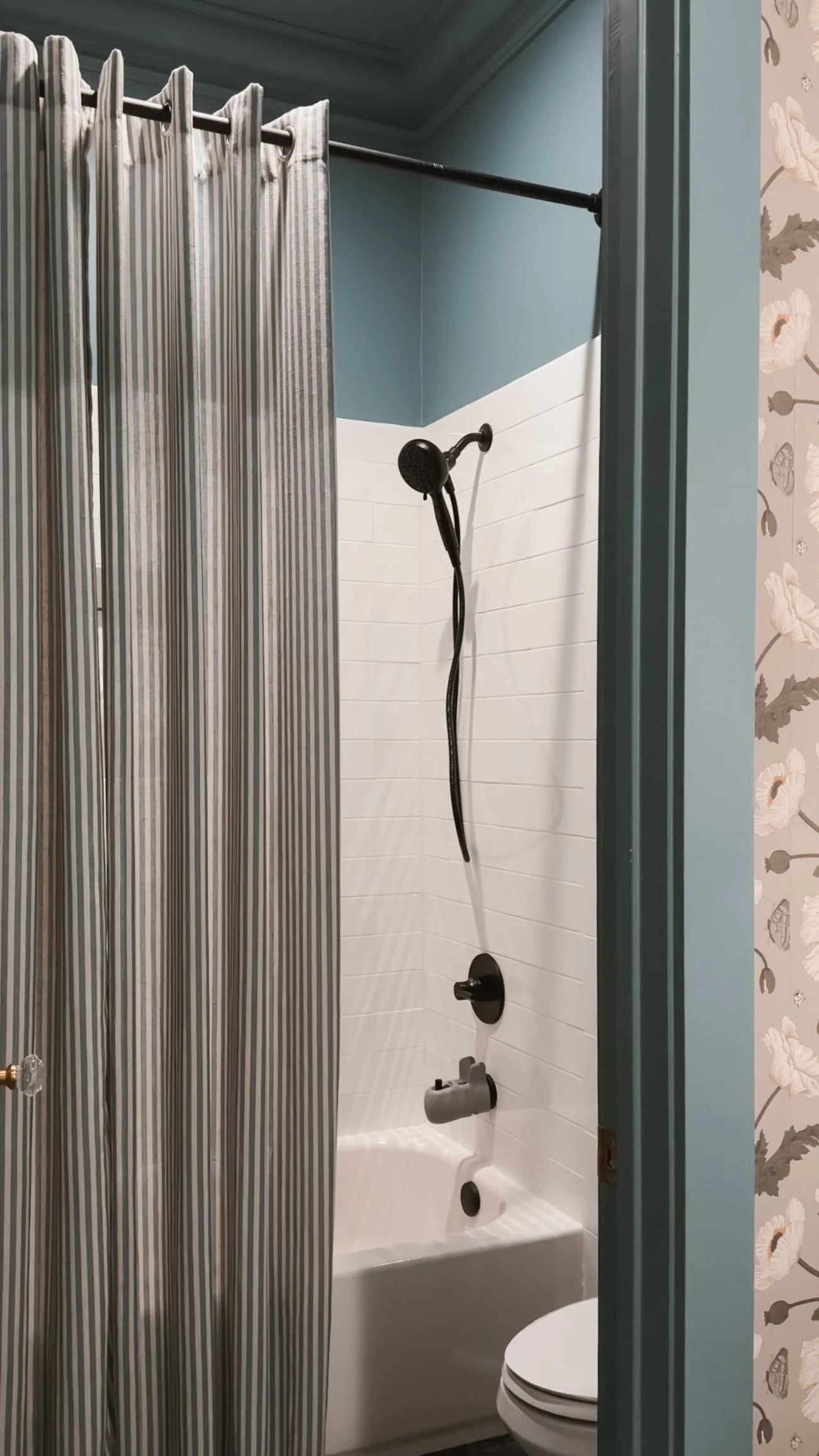
A Tranquil Blue Bathroom Retreat
Norwegian Blue by Behr brings a calming, cool tone to this beautifully color-drenched bathroom. The front room, with its sinks, features a floral wallpaper that adds texture and depth, while the back room—containing the toilet and shower—embraces the full power of this rich blue, creating a serene and cohesive feel throughout.
The eggshell sheen offers a soft, reflective glow that enhances the depth of Norwegian Blue, providing just the right amount of light without being too shiny. The color works harmoniously with the bathroom's fixtures and textures, making the space feel both fresh and tranquil. Whether you’re washing up or relaxing, this blue bathroom offers a peaceful retreat that feels timeless and inviting.
If there's something in this room that catches your eye and you'd like the link, just click here!


Warm & Inviting: A Guest Room with Rich Comfort
Nut Brown by Behr creates a cozy and welcoming atmosphere in the guest room, wrapping the space in a rich, earthy hue. Color drenching the walls in this deep brown gives the room a grounded, intimate feel, perfect for guests to relax and unwind.
The eggshell sheen adds a soft, subtle glow that highlights the depth of Nut Brown without overpowering the space. This warm, inviting color pairs beautifully with plush bedding, soft lighting, and natural wood accents, creating a serene environment that makes every guest feel at home. The timeless richness of Nut Brown ensures the room remains stylish and comfortable, offering a restful retreat for anyone who stays.
If there's something in this room that catches your eye and you'd like the link, just click here!
IF YOU ENJOYED THIS POST, YOU MIGHT BE INTERESTED IN MY playroom makeover.
FOLLOW ME ON MY SOCIALS!

Playroom Makeover
The Ultimate Playroom Makeover: A Color-Drenched Dream in Pressed Flower
If there's one space in our home that sees the most creativity, giggles, and pure joy, it's my daughter's playroom. And after its latest refresh, it’s better than ever! From the dreamy pink walls to the upgraded storage and new activity tables, every detail makes this space both beautiful and functional. Let’s dive into the details of this color-drenched paradise.


The Bold and Beautiful Wall Color
First things first: the walls! I wanted something warm, inviting, and playful, so I went all-in with Pressed Flower by Sherwin-Williams. It’s the perfect rich, rosy hue that creates a cozy yet energizing space for playtime. To add depth and character, I incorporated box moulding with basecap trim, which gives the room a touch of classic charm while keeping it playful.
A Pink Light Fixture to Tie It All Together
A pink room needs the perfect pink light fixture, and I found just the one! It adds a whimsical yet modern touch that complements the Pressed Flower walls beautifully. The soft glow makes everything feel warm and magical—exactly the vibe I wanted for this space.


Upgrading Storage: From Cube Shelf to IKEA Trofast
Storage is everything in a playroom, and I recently swapped out our basic 8-cube shelf for the IKEA Trofast system—and WOW, what a difference! The drawers make organization a breeze, keeping toys neatly tucked away but still accessible for little hands. Now, everything has a home, and clean-up time is so much easier (for both of us!).
Playroom Must-Haves: Seating, Tables, and More!
No playroom is complete without comfy seating, and the egg chair is hands-down one of the best purchases we’ve made. It’s the perfect spot for reading, relaxing, or just hanging out while playtime is in full swing.
For activities, we have a classic kids’ table, perfect for coloring and Play-Doh. And for Christmas, we added a multi-functional chalk/car/LEGO table, which has quickly become a favorite! Whether she's doodling, racing toy cars, or building her latest LEGO masterpiece, this table does it all.


Her Favorite Playroom Pieces
Some of the most-loved items in the playroom include:
Her dollhouse – an absolute steal of a deal and a favorite for hours of imaginative play.
The IKEA play kitchen – which I gave a custom makeover! (Check out the full DIY transformation here).
The easel – a chalkboard on one side, a magnetic whiteboard on the other, with an option for paper to roll down. Perfect for endless creative expression!
This playroom refresh has made such a difference in how my daughter plays and enjoys her space. It’s colorful, functional, and, most importantly, designed to grow with her. If you’re looking to revamp a playroom, my biggest tips are to prioritize storage, embrace color, and choose multi-functional pieces that can adapt as your little one’s interests evolve.
What’s your must-have for a playroom? Let me know in the comments!
Links at a glance
Paint: Pressed Flower by Sherwin Williams (Sheen is flat, but I would recommend eggshell instead)
My Whole Ikea Trofast System:
Edge Shelves (2 stacked on each edge)
Tall White Shelf (next to door)