
Estate Sale Tips
Welcome back to Mae’s Thrift Tips! If you love a good bargain and hunting for hidden gems, then estate sales are a must. But I know what you’re thinking—how do you even find them? Well, today I’m spilling the secret that the gatekeepers don’t want you to know. (Sorry, guys!)
The number one question I get asked is: How do you find out about estate sales? And the answer is so simple… it’s an app!

The Estate Sale Secret: EstateSales.net
Yes, you heard that right. The easiest way to find estate sales near you is by using EstateSales.net. This app is a total game-changer for thrift lovers, antique hunters, and deal-seekers alike. Here’s why I love it:
✔ Customized Searches – You can filter estate sales by location, so you only see the ones closest to you. No more aimless driving around!
✔ Sale Schedules – The app shows you exactly when and where sales are happening, so you never miss out on a good one.
✔ Photo Previews – See pictures of what’s available before you even leave the house. This helps you decide if it’s worth your time.
✔ RSVP Options – Some sales require you to RSVP, and the app makes it super easy to do that.


Pro Tips for Estate Sale Success
Now that you know where to find estate sales, here are a few tips to make the most of your treasure hunts:
1️⃣ Arrive Early – The best items go fast! If you see something good in the preview photos, be there when the doors open.
2️⃣ Bring Cash – While some sales accept cards, cash is always a safe bet and can sometimes help with negotiating a better price.
3️⃣ Be Respectful – Remember, estate sales often happen due to major life transitions, so be kind and courteous.
4️⃣ Negotiate Wisely – Prices are usually firm on the first day but may be more flexible later in the sale. Day two is usually 25% off, and the last day is typically 50% off—so be there at opening! If you want the absolute best deal, go an hour before the sale ends on the last day. That’s when sellers are most willing to make amazing deals.
So there you have it—the inside scoop on how to find the best estate sales near you! Go download EstateSales.net and start planning your next thrift adventure. Happy hunting! 🛍️✨


Have you scored any amazing finds at an estate sale? Share your best thrifted treasures in the comments below!
IF YOU ENJOYED THIS POST, YOU MIGHT BE INTERESTED IN my Upscaling Plants post.
FOLLOW ME ON MY SOCIALS!

How To Make a Floor Plan: To Scale
Creating a floor plan to scale is a game-changer when it comes to designing and arranging a space. Whether you're planning a new layout, rearranging furniture, or just getting a better feel for your room’s dimensions, mapping it out properly will save you a ton of time and effort. Here’s how to do it step by step.
Step 1: Start with a Rough Sketch
Before you even think about scale, grab a piece of paper and make a rough sketch of your room. This doesn’t have to be perfect—it’s just a guide to help you take accurate measurements.
Here are the key measurements to note:
The perimeter of your walls
The dimensions of your doors and windows
Any architectural details or built-in furniture
The sizes of your existing furniture pieces (if you plan to include them in your layout)
Once you’ve got those measurements jotted down, your rough sketch should look something like this:


Step 2: Transfer to Scale Using Graph Paper
Now, it’s time to make it official! Grab some graph paper because we’re going to transfer your rough sketch into a properly scaled floor plan.
To keep things simple, let’s set our scale: One box = 6 inches in real life.
For example, if your wall measures 13 feet, here’s how you plot it:
Double the feet count (since each foot contains two 6-inch segments): 13 feet → 26 boxes
If your window wall is 11 feet 8 inches:
11 feet = 22 boxes
8 inches is just over one extra box, so round up slightly to 23 boxes (with a touch of a 24th box for accuracy)


Step 3: Add Doors and Windows
Now, let’s position doors and windows precisely.
Say the distance from the left wall to the start of your pocket door is 6 feet 3 inches. That translates to:
6 feet = 12 boxes
3 inches = half a box
If on the other side, the measurement is 4 feet 1 inch, that would be:
4 feet = 8 boxes
1 inch = just a touch into the next box
Now that everything is positioned correctly, your to-scale floor plan should resemble this:


Step 4: Add Furniture to Scale
Here’s where the magic happens! Using the same scale (1 box = 6 inches), sketch out your furniture pieces, cut them out, and move them around on your floor plan.
By doing this, you can:
Experiment with different layouts
Ensure there’s enough walking space
Avoid placement mistakes before moving heavy furniture
For example, I quickly realized that centering the bed on this wall wouldn’t work—there wouldn’t be enough walking space to access the bathroom. By shifting things around, I could find a layout that worked without cramping the room.


Why This Method Works
This technique is a lifesaver because it allows you to visualize your space accurately. You can see what your current furniture fits, what doesn’t, and even test new furniture sizes before making a purchase. No more guessing if that new couch will be too big—it’s all planned out beforehand!
Give this method a try next time you're rearranging a room—it’ll make your life so much easier!
IF YOU ENJOYED THIS POST, YOU MIGHT BE INTERESTED IN my blue floral bathroom makeover post.
FOLLOW ME ON MY SOCIALS!

Hallway Gallery Wall
How I Created My Hallway Gallery Wall (and Had an Excuse to Go Thrifting!)
There’s just something about a well-curated gallery wall that makes a home feel extra special! I’ve been thrifting and estate sale-hopping for months, collecting frames and unique pieces, but even after all that—I still didn’t have enough to finish my hallway wall. So, naturally, I had to take another trip to my favorite antique shop, Queen of Hearts, and grab a few more fun finds. (I mean, twist my arm, right?)
Once I had everything, it was time to get to work! Here’s how I put it all together:
Step-by-Step: Hanging a Gallery Wall Like a Pro
Trace & Cut – I traced each piece onto brown paper and cut them out individually. Pro tip: Mark the orientation on each paper cutout, so you don’t accidentally hang anything upside down later.
Plan Your Layout – Using painter’s tape, I arranged and rearranged my paper cutouts on the wall until I found a layout I loved. The best part? You can move them around as many times as you want before committing!
Toothpaste Trick for Easy Nail Placement – This hack is a game changer! I dabbed a little toothpaste on the back of each piece where it hangs on the nail, then gently pressed it against the wall. When I pulled it away, it left the perfect little mark for where to hammer my nail!
Hang It Up! – I removed the paper cutouts, hammered in my nails (or used hooks where needed), and hung each piece. A handheld level helped keep things straight, but if you have a laser level, even better!
How I Hung My Pieces
None of my pieces were too heavy, so I used a mix of:
✔ A picture hanging kit
✔ Velcro Command Hooks for 1-2 pieces
✔ These awesome new plate hangers I found (a great way to mix in non-frame pieces!)
And that’s it! My gallery wall is officially up, and I LOVE how it turned out! There’s even a little room at the top to grow—which means more thrifting trips in my future. (Like I needed an excuse!)
If you’ve been thinking about starting a gallery wall, do it! It’s such a fun way to showcase your style, and with these simple steps, it’s easier than you think. Happy decorating!!
For all of my gallery wall essentials click here!!

IF YOU ENJOYED THIS POST, YOU MIGHT BE INTERESTED IN My color drenching post!
FOLLOW ME ON MY SOCIALS!

Color Drenching
Transform Your Space with Color Drenching
If you love bold, statement-making interiors, color drenching might just be your new favorite design trick! This trend is all about embracing a single hue and using it across walls, ceilings, trim, and even furniture for a rich, immersive effect. Whether you want to create a cozy, moody vibe or a bright, energetic space, color drenching is an easy way to make a big impact. Let’s dive in!


Moody Elegance: Color Drenching in the Primary Bedroom
This stunning room is a perfect example of the power of color drenching. Painted in Field Trip by Clare, the deep olive green envelops the walls, ceiling, trim, and even doors in an ultra-cohesive and immersive atmosphere. The single-hue approach enhances the room’s architectural details, making the intricate molding and paneling stand out in a sophisticated way. The eggshell sheen adds a subtle warmth and soft texture that elevates the space.
This space proves that color drenching isn’t just about painting everything the same shade—it’s about layering textures, finishes, and complementary tones to create a truly stunning effect!
If there's something in this room that catches your eye and you'd like the link, just click here!


A Bold and Inviting Hallway with Color Drenching
Hallways are often overlooked in design, but this space shows how a rich, saturated color can elevate even the most transitional areas into something special. Painted in Reddened Earth by HGTV Home by Sherwin-Williams, the warm, earthy tone envelops the walls, trim, and ceiling in a cozy yet dramatic embrace. This terracotta-inspired hue adds depth and warmth, creating a welcoming atmosphere as you move through the space.
Color drenching here brings out the architectural details, allowing the moldings and doorways to flow seamlessly into the design, avoiding any interruptions to the visual flow. The warm undertones complement the natural wood elements and soft lighting, enhancing the intimacy and stylish vibe of the space. The walls and ceiling are finished in satin sheen, while the doors have a semi-gloss finish. If I had to do it again, I would opt for satin on the doors as well—the semi-gloss feels a bit too glossy for my taste.
This hallway proves that even the smallest spaces can make a big impact with the right color and finish choices!
If there's something in this room that catches your eye and you'd like the link, just click here!


Soft & Serene: A Dreamy Bedroom with 50% Malted Milk
For a cozy yet elevated feel, this 50% Malted Milk by Sherwin-Williams color-drenched bedroom is the perfect balance of warmth and softness. By using a lighter, custom-mixed version of this creamy beige, the space feels airy and inviting while still offering a rich, enveloping effect. The walls, ceiling, and trim all blend seamlessly, creating a soothing and cohesive environment—perfect for a restful retreat.
The eggshell sheen adds just the right amount of softness while reflecting a touch of light, keeping the space feeling warm and welcoming. Looking back, I would opt for 100% Malted Milk instead for a bit more depth and richness, but this toned-down version still creates a beautiful and serene atmosphere.
Color drenching in this subtle, warm tone proves that neutrals can be just as impactful as bold colors, bringing depth and character while maintaining a timeless, calming aesthetic.
If there's something in this room that catches your eye and you'd like the link, just click here!


Fiery & Bold: A Red Bathroom
For a bathroom with impact, Salute by Sherwin-Williams is the perfect deep red hue. Its rich, warm tone envelops the space, creating a bold yet inviting atmosphere. Paired with crisp white trim, the contrast highlights the red's intensity without feeling overwhelming.
The eggshell sheen offers a soft luster, reflecting light while maintaining the color's depth and drama. This striking shade pairs beautifully with gold hardware and dark wood, creating a dynamic yet cozy retreat. Salute proves that bold colors can add warmth and character, transforming a bathroom into a memorable space.
If there's something in this room that catches your eye and you'd like the link, just click here!


Bright & Airy: A Sunroom Drenched in Light
For a sunroom that celebrates natural light, Maison Blanche by HGTV Home by Sherwin-Williams is the perfect soft, creamy white. The hue captures the sunlight streaming through the windows, enhancing the space with a fresh, open feel. Color drenching the walls, ceiling, and trim creates a seamless, airy environment that feels expansive and peaceful.
The satin sheen adds a subtle glow, reflecting light while maintaining a smooth, sophisticated finish. The warm undertones of Maison Blanche complement the abundance of natural light, making the room feel both bright and inviting. This soft white pairs effortlessly with light wood furniture and vibrant greenery, transforming the sunroom into a serene retreat that feels connected to the outdoors.
If there's something in this room that catches your eye and you'd like the link, just click here!


A Playroom Full of Color & Fun
For a lively and cheerful playroom, Pressed Flower by Sherwin-Williams brings the perfect pop of color. This soft, yet vibrant hue adds warmth and energy to the space, creating an environment where creativity can flourish. Drenching the walls in this joyful tone envelops the room in a welcoming, playful atmosphere.
The flat finish provides a smooth, understated look, but I recommend opting for eggshell for a bit more durability and a subtle sheen that’s easier to clean. Pressed Flower pairs beautifully with colorful toys, playful patterns, and cozy textures, making it a space where fun and imagination can run wild. It’s the perfect backdrop for a room that will grow with your child, offering both whimsy and warmth.
If there's something in this room that catches your eye and you'd like the link, just click here!

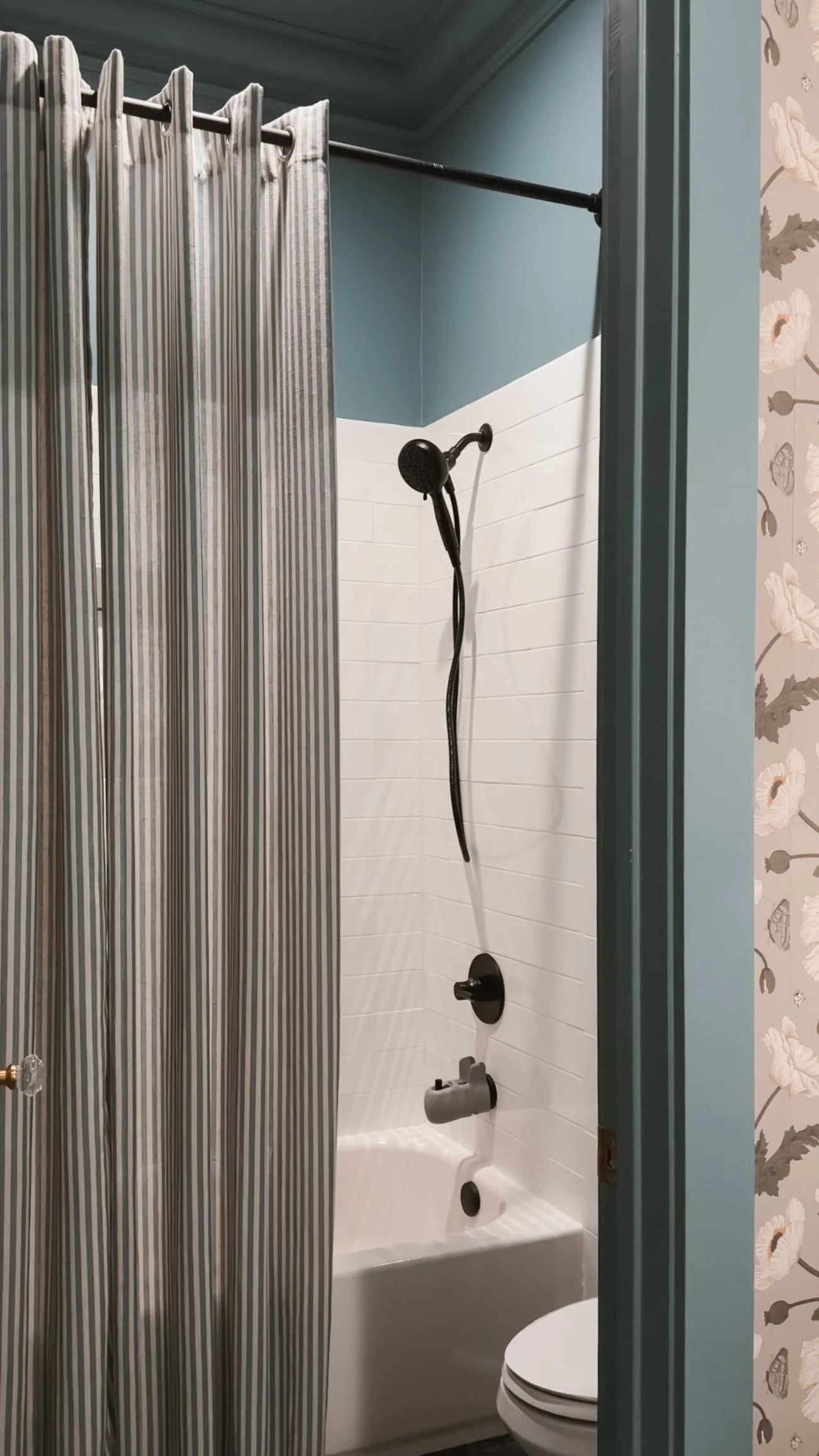
A Tranquil Blue Bathroom Retreat
Norwegian Blue by Behr brings a calming, cool tone to this beautifully color-drenched bathroom. The front room, with its sinks, features a floral wallpaper that adds texture and depth, while the back room—containing the toilet and shower—embraces the full power of this rich blue, creating a serene and cohesive feel throughout.
The eggshell sheen offers a soft, reflective glow that enhances the depth of Norwegian Blue, providing just the right amount of light without being too shiny. The color works harmoniously with the bathroom's fixtures and textures, making the space feel both fresh and tranquil. Whether you’re washing up or relaxing, this blue bathroom offers a peaceful retreat that feels timeless and inviting.
If there's something in this room that catches your eye and you'd like the link, just click here!


Warm & Inviting: A Guest Room with Rich Comfort
Nut Brown by Behr creates a cozy and welcoming atmosphere in the guest room, wrapping the space in a rich, earthy hue. Color drenching the walls in this deep brown gives the room a grounded, intimate feel, perfect for guests to relax and unwind.
The eggshell sheen adds a soft, subtle glow that highlights the depth of Nut Brown without overpowering the space. This warm, inviting color pairs beautifully with plush bedding, soft lighting, and natural wood accents, creating a serene environment that makes every guest feel at home. The timeless richness of Nut Brown ensures the room remains stylish and comfortable, offering a restful retreat for anyone who stays.
If there's something in this room that catches your eye and you'd like the link, just click here!
IF YOU ENJOYED THIS POST, YOU MIGHT BE INTERESTED IN MY playroom makeover.
FOLLOW ME ON MY SOCIALS!

DIY: Big Wall Art
How to Make Your Own Large-Scale Art on a Budget
Big art can be pricey, but that doesn’t mean you can’t have a statement piece in your home! I wanted a large-scale art piece without the hefty price tag, so I got creative and made one myself. Here’s how you can do it too!
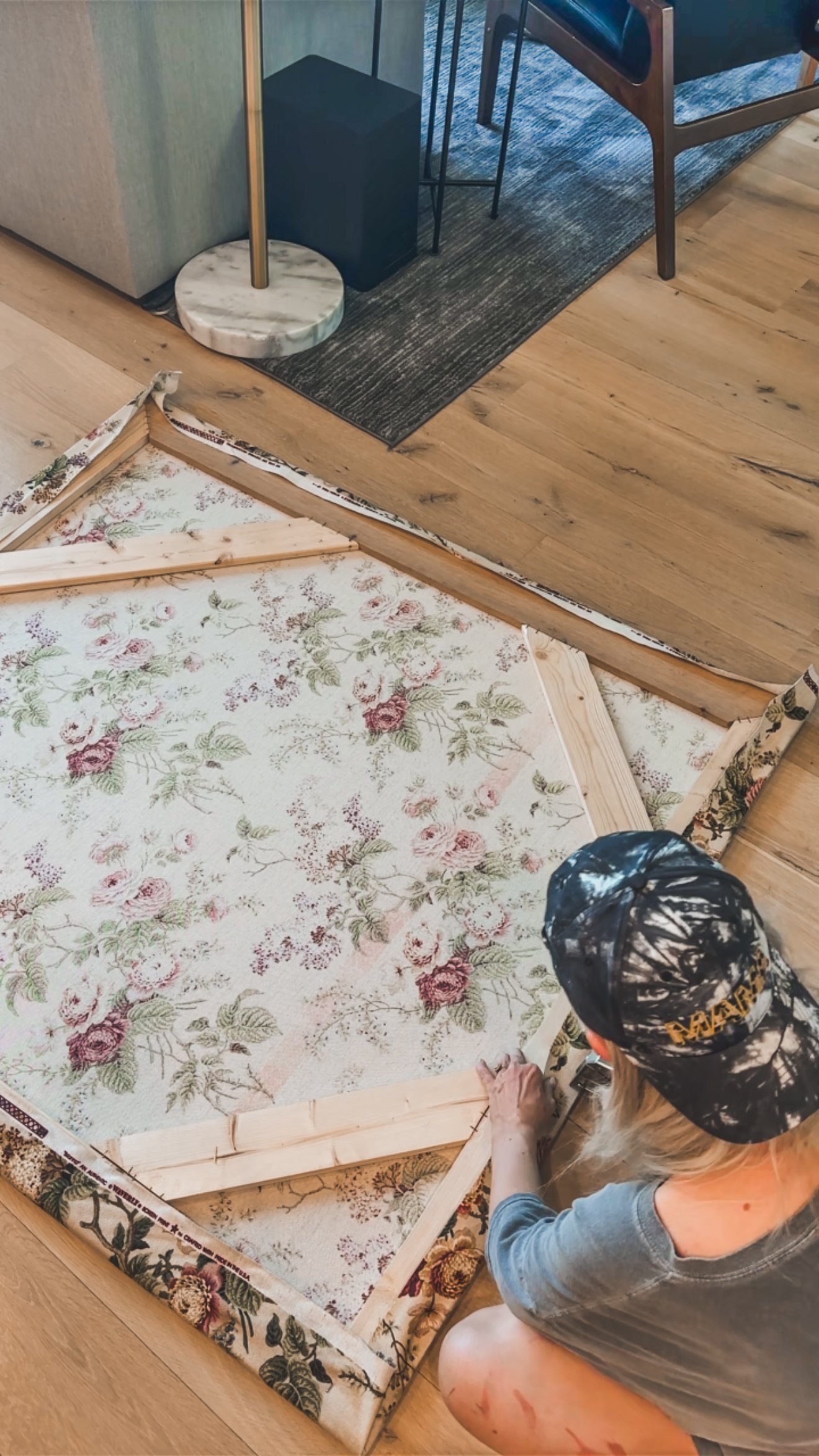
Finding the Perfect Fabric
I stumbled upon a roll of upholstery fabric at an antique store for just $21—score! If you’re on the hunt for fabric, check out thrift stores, antique shops, or even repurpose curtains or shower curtains.
Building the Frame
I figured out the measurements for the size I wanted and luckily had some scrap 1x4s lying around, so I used those to create the frame. If I were to redo this, I’d add a center support piece for extra stability, but it worked out just fine!
To assemble the frame, I connected my 45-degree cuts using wood glue, brad nails, and a LOT of heavy-duty staples—seriously, like five staples per joint. It might look a little Frankenstein-ish, but hey, no one will see that part!


Attaching the Fabric
Once my frame was solid, I draped the fabric over the non-stapled side and flipped it over to make sure the pattern was straight. I started by stapling a row at the top to keep the fabric in place, then trimmed off the excess.
For the best results, I pulled the fabric tight, stapled a few spots, moved to the next side, and repeated—just working my way around to keep everything straight and even.

Hanging It Up
To hang the piece, I attached two D-ring hooks. I don’t remember the exact measurements, but I made sure to place them evenly (for example, 3 inches from the side and 2 inches from the top).
Then came the moment of truth—flipping it over for the big reveal!
I use a laser level to make sure it was on the wall perfectly straight, used toothpaste on the D-rings so I knew exactly where to put in my screws, and used anchors where there were no studs.


I absolutely love how this turned out, and it was such a budget-friendly way to get a large art piece! If you’re thinking of making your own, you can use all kinds of fabric—curtains, shower curtains, or whatever catches your eye. Give it a try and let me know how yours turns out!
If you enjoyed this post, you might be interested in my hallway makeover.
Follow me on my socials!

My Oversized Art
Oversized Art in My Entryway & Bedroom: A Bold Statement
One of my favorite ways to make a space feel grand and intentional is with oversized artwork. It’s a game-changer—especially in areas with high ceilings where you really want to embrace the scale of the space. I recently added large statement pieces from Big Wall Decor to my entryway and bedroom, and I’m obsessed with how they transformed both rooms.
Bedroom:
For my bedroom, I went with the 60”x60” Infinity Frame in black and the Black Forest III artwork. This monochromatic floral piece adds the perfect amount of moodiness and depth to my space. I love how it complements my decor while also making a bold statement against my high ceilings.


Entryway:
In my entryway, I have the 60”x90” Infinity Frame in black, and I love the versatility it offers. I switch between two different pieces depending on my mood and the season.
Beige Posy Bouquet Watercolor – This stunning floral piece is available from an artist on BigWallDecor’s website. I opted for it without the artist's signature so I could hang it horizontally, which fits my space perfectly.


For the other piece I used the Custom Artwork option. The print is called Garden in May – I took advantage of the Open Access platform from the Smithsonian, a free resource for finding and downloading copyright-free artwork. Garden in May is such a dreamy, lush piece that brings a fresh and timeless feel to my entry.
If you haven’t explored the Open Access platform yet, it’s an amazing way to source high-quality artwork at no cost. It’s one of my go-to tricks for finding unique pieces that feel curated and personal.


Why Oversized Art Works
If you’re on the fence about large-scale artwork, let me tell you—it’s worth it! Here’s why:
Makes a Space Feel Bigger – Instead of multiple smaller pieces, one oversized artwork draws the eye upward and expands the space visually.
Adds Drama & Impact – Whether it’s a soft floral or a moody monochrome, large art instantly creates a focal point.
Versatile & Changeable – With an Infinity Frame, swapping out art is easy, making it a flexible choice for ever-evolving styles.
If you’re looking to elevate your home with oversized art, Big Wall Decor has so many great options! And don’t forget to check out the Open Access platform for free artwork downloads—it’s a total hidden gem.